Introduction
In April 2011, the MetaHIT consortium published the discovery of enterotypes in the human gut microbiome (Arumugam, Raes et al. 2011). The data associated with the study were made publicly available, and the theory behind the computational procedures was explained in the Supplementary Information of the article. However, the exact set of commands (in the R environment) that would enable anyone to reproduce all the figures in the article was not reported in the supplement. Here we present a detailed tutorial to reproduce our work in the original article using R with datasets used in the original article.
A summary of the R code that reproduces the results of this tutorial can be downloaded from here, but we highly recommend completing it along with the detailed information that is provided below.
Datasets
There are three datasets in the article. The main conclusions are derived from the Sanger-based metagenome sequences, and we use that dataset throughout this tutorial. The steps to process the other datasets are the same except when mentioned otherwise. Note: The initial dataset contains 39 samples. Four Japanese infant samples were excluded as infants are known to harbor very heterogeneous, unstable and distinctive microbiota. Two American adult samples were excluded due to an unusually low level of Bacteroides and suspected technical artefacts. Please see the article and the references therein for further details.
First, download the genus abundance table for the Sanger dataset containing 33 samples, and load it as a table in the R environment:
data=read.table("MetaHIT_SangerSamples.genus.txt", header=T, row.names=1, dec=".", sep="\t")
data=data[-1,]
Understanding the genus abundance table
The genus abundance table summarizes the relative genus abundances of 33 samples. This table is in R table format - meaning the first row is the column headers with 33 sample identifiers, and the following rows are 34 columns each with the first column being the genus identifiers. The second row in the two metagenome based datasets, with the genus identifier "-1", corresponds to the fraction of metagenomic reads that cannot reliably be assigned to a known genus. We introduced this unassigned fraction (instead of ignoring all the reads that are not reliably assigned to a known genus) after observing that there is large variation between samples in the fraction of reads that can be reliably assigned (e.g., in the table above, between 19% to 78% of the reads are unassigned). Accounting for the unassigned fraction ensures that relative abundances of a given genus across multiple samples can be compared more reliably. However, since this fraction does not represent a real genus, and is a conglomerate of all the genera for which we do not have representatives so far, we do not consider it as a feature while estimating the Jensen-Shannon Distance (D) for the clustering procedure so that similar levels of unassigned fraction are not mistaken as real phylogenetic similarity. This means that the relative abundance table is NOT renormalized - it still sums to 1 when "unassigned" fraction is included, but the "unassigned" fraction is not used in the calculation of the Jensen-Shannon Distance.
Clustering
Samples were clustered based on relative genus abundances using JSD distance and the Partitioning Around Medoids (PAM) clustering algorithm. The results were assessed for the optimal number of clusters using the Calinski-Harabasz (CH) Index (Calinski & Harabasz, 1974). We also evaluated the statistical significance of the optimal clustering by comparing the Silhouette coefficient (Rousseeuw, 1984) of the optimal clustering to a distribution of Silhouette coefficients derived from a simulation, which models the null distribution with no clustering (see the section on Simulating data below).
Distance metric
Genus abundance profiles (phylogenetic) and OG abundance profiles (functional) were normalized to generate probability distributions (called abundance distributions hereafter). We used a probability distribution distance metric related to Jensen-Shannon divergence (JSD) to cluster the samples. Jensen-Shannon Divergence is a positive definite measure, satisfying the following conditions:
It is also symmetric:
But it does not satisfy the triangular inequality condition to be considered a real metric.
On the other hand, the square root of JSD is a real distance metric (Endres & Schindelin, 2003; which is cited as ref. 59 in the supplement of Arumugam et al 2011). This is the reason why we used the square root and not JSD itself.
The Jensen-Shannon distance D(a,b) between samples a and b is defined as:
where Paand Pb are the abundance distributions of samples a and b and JSD(x,y) is the Jensen-Shannon divergence between two probability distributions x and y defined as :
JSD<- function(x,y) sqrt(0.5 * KLD(x, (x+y)/2) + 0.5 * KLD(y, (x+y)/2))
where m=(x+y)/2 and KLD(x,y) is the Kullback-Leibler divergence between x and y defined as
KLD <- function(x,y) sum(x * log(x/y))
We added a pseudo count of 0.000001 to the abundance distributions to avoid zero in the numerator and/or denominator of equation (3).
Here is an example complete function to create JSD distance matrix in R:
 dist.JSD <- function(inMatrix, pseudocount=0.000001, ...) {
	KLD <- function(x,y) sum(x *log(x/y))
	JSD<- function(x,y) sqrt(0.5 * KLD(x, (x+y)/2) + 0.5 * KLD(y, (x+y)/2))
	matrixColSize <- length(colnames(inMatrix))
	matrixRowSize <- length(rownames(inMatrix))
	colnames <- colnames(inMatrix)
	resultsMatrix <- matrix(0, matrixColSize, matrixColSize)

  inMatrix = apply(inMatrix,1:2,function(x) ifelse (x==0,pseudocount,x))

	for(i in 1:matrixColSize) {
		for(j in 1:matrixColSize) {
			resultsMatrix[i,j]=JSD(as.vector(inMatrix[,i]),
			as.vector(inMatrix[,j]))
		}
	}
	colnames -> colnames(resultsMatrix) -> rownames(resultsMatrix)
	as.dist(resultsMatrix)->resultsMatrix
	attr(resultsMatrix, "method") <- "dist"
	return(resultsMatrix)
 }
Now, we can apply this function on our data:
data.dist=dist.JSD(data)Algorithm
We used the Partitioning around medoids (PAM) clustering algorithm to cluster the abundance profiles. PAM derives from the basic k-means algorithm, but has the advantage that it supports any arbitrary distance measure and is more robust than k-means. It is a supervised procedure, where the predetermined number of clusters is given as input to the procedure, which then partitions the data into exactly that many clusters.
In R, we used the pam() function in cluster library
pam(as.dist(x), k, diss=TRUE) # x is a distance matrix and k the number of clusters pam() returns different objects, but we focused only on the $clustering.
Here is an example function to perform PAM clustering in R:
 pam.clustering=function(x,k) { # x is a distance matrix and k the number of clusters
                         require(cluster)
                         cluster = as.vector(pam(as.dist(x), k, diss=TRUE)$clustering)
                         return(cluster)
                        }
A test run on our dataset with k=3 clusters as an example, before determining the optimal number of cluster (see section below) :
data.cluster=pam.clustering(data.dist, k=3) Optimal number of clusters
To assess the optimal number of clusters our dataset was most robustly partitioned into, we used the Calinski-Harabasz (CH) Index that shows good performance in recovering the number of clusters. It is defined as:
where Bk is the between-cluster sum of squares (i.e. the squared distances between all points i and j, for which i and j are not in the same cluster) and Wk is the within-clusters sum of squares (i.e. the squared distances between all points i and j, for which i and j are in the same cluster). This measure implements the idea that the clustering is more robust when between-cluster distances are substantially larger than within-cluster distances. Consequently, we chose the number of clusters k such that CHk was maximal.
here we use the function index.G1() from the library clusterSim:
				require(clusterSim)

				nclusters = index.G1(t(data), data.cluster,  d = data.dist, centrotypes = "medoids")
We need to evaluate the CH index for every number of clusters k, and here is example code to do it (and plot the result):
	nclusters=NULL

	for (k in 1:20) {
		if (k==1) {
			nclusters[k]=NA
		} else {
			data.cluster_temp=pam.clustering(data.dist, k)
			nclusters[k]=index.G1(t(data),data.cluster_temp,  d = data.dist,
			centrotypes = "medoids")
		}
	}

	plot(nclusters, type="h", xlab="k clusters", ylab="CH index")
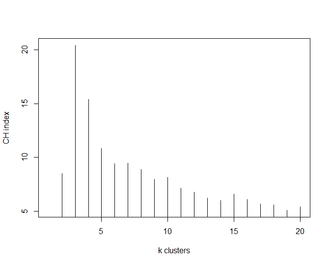
This has shown that the optimal number of clusters for this particular dataset is 3 (k=3).
data.cluster=pam.clustering(data.dist, k=3)
Cluster validation
Cluster validation methods are useful to assess the quality of a clustering with respect to the underlying data points. Here we use the silhouette validation technique. The silhouette width S(i)of individual data points i is calculated using the following formula:
where a(i) is the average dissimilarity (or distance) of sample i to all other samples in the same cluster, while b(i) is the average dissimilarity (or distance) to all objects in the closest other cluster.
The formula implies -1 =< S(i) =< 1 . A sample which is much closer to its own cluster than to any other cluster has a high S(i) value, while S(i) close to 0 implies that the given sample lies somewhere between two clusters. Large negative S(i) values indicate that the sample was assigned to the wrong cluster.
To assess the silhouette coefficient S(i), we simply used the function silhouette() from the cluster library which use as an input the cluster and distance matrix objects. To obtain a global assessment of the cluster quality, the average S(i) over all data points is a useful measure.
obs.silhouette=mean(silhouette(data.cluster, data.dist)[,3])Simulating data
For a given set of N feature vectors, each representing the phylogenetic (genus, phylum, etc) or the functional (gene, orthologous group, functional modules, etc) composition of a metagenomic sample, we simulated N hypothetical metagenomic samples containing the same number of features by sampling from a continuum as follows:
Generated values are then normalized so that abundances within a sample sum to 1.
We then clustered the simulated data, and estimated the Silhouette coefficient for each simulation. We then compared these to the Silhouette coefficient of the optimal clustering of our dataset to evaluate its statistical significance. We cannot however rule out the possibility that a statistically significant result can arise from a poor choice of model, even if the optimal clustering structure does not provide a good model for our data.
Graphical interpretation
Enterotypes could be visualized in many different ways. Two of these are between-class analysis (BCA) and principal coordinates analysis (PCoA). BCA is the first one used in the Arumugam et al article and is useful to visualize the taxonomic drivers of clusters (i.e. enterotype). However, PCoA is more commonly used in ecological studies and we currently recommended this visualization technique, using the JSD distance matrix as an input.
Between-class analysis
Between-class analysis (BCA) was performed to support the clustering and identify the drivers for the enterotypes. The analysis was done using R with the ade4 package. Prior to this analysis, in the Illumina dataset, genera with very low abundance were removed to decrease the noise, if their average abundance across all samples was below 0.01%. The between-class analysis is a particular case of principal component analysis with an instrumental variable: here the variable is a qualitative factor (i.e. an enterotype cluster). The between-class analysis enables us first to find the principal components based on the center of gravity of each group in a way to highlight differences between groups and then to link each sample with its group. It is a supervised projection of the data, where the distance between the pre-defined classes, in this case enterotypes, is maximized. Hence the first two components in this projection are not necessarily the same as the first two components that explain the highest variability in the data.
Here is a function to remove the noise (ie. low abundant genera):
 noise.removal <- function(dataframe, percent=0.01, top=NULL){
	dataframe->Matrix
	bigones <- rowSums(Matrix)*100/(sum(rowSums(Matrix))) > percent
	Matrix_1 <- Matrix[bigones,]
	print(percent)
	return(Matrix_1)
 }
We advise to apply this function to data generated using short sequencing technologes, like Illumina or Solid. In the original manuscript, we only applied noise removal on the Solexa data, and not on Sanger or pyrosequencing data. The noise removal function could be applied as follows:
data.denoized=noise.removal(data, percent=0.01)
Finally, we can perform the between-class analysis and plot the result using the s.class() function
 obs.pca=dudi.pca(data.frame(t(data)), scannf=F, nf=10)
 obs.bet=bca(obs.pca, fac=as.factor(data.cluster), scannf=F, nf=k-1)
 s.class(obs.bet$ls, fac=as.factor(data.cluster), grid=F)
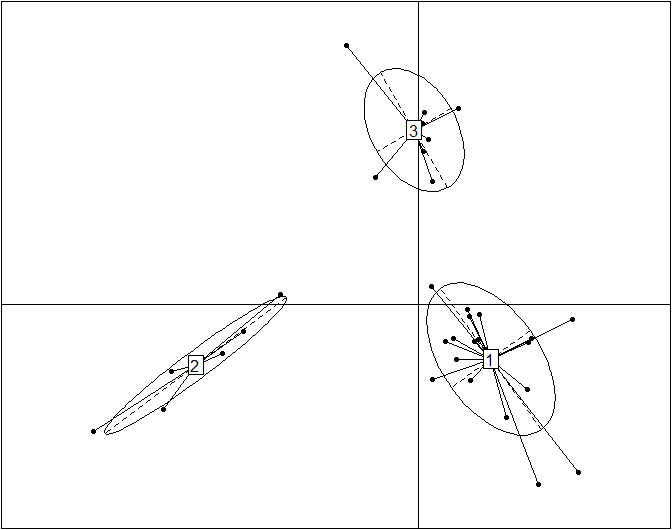
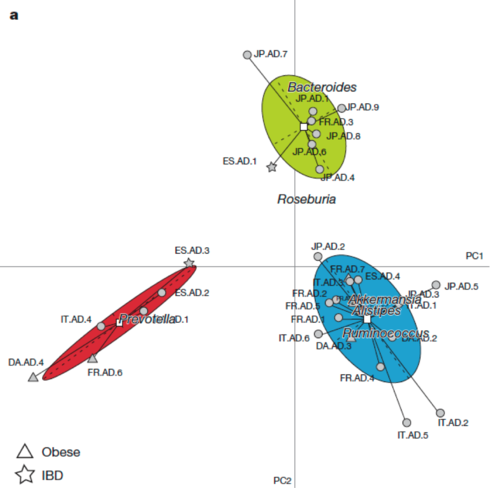
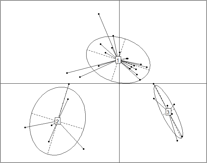
This plot reproduces the Figure 2a from the original article (included below for comparison) without the embellishments added for publication. Cluster labels (1,2,3) are randomly assigned by the clustering procedure, and they correspond to enterotypes ET3, ET1 and ET2, respectively. The published Figure 2a from the original article (below) was generated by editing the original plot by (1) adding labels for samples, (2) using three different symbols for samples instead of the default dots, (3) coloring the ellipses for different enterotypes and (4) projecting the driver genera for each enterotype onto the BCA.
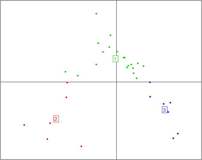
Here is the plot above without the ellipses representing the three enterotypes and without the enterotype centroid connectors.
s.class(obs.bet$ls, fac=as.factor(data.cluster), grid=F, cell=0, cstar=0, col=c(4,2,3))
More information and tutorials about the ade4 package can be found here
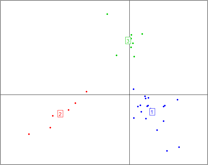
Principal coordinate analysis
Here is a simple code snippet to perform a PCoA with pco() and then plot it with s.class():
 obs.pcoa=dudi.pco(data.dist, scannf=F, nf=3)

 s.class(obs.pcoa$li, fac=as.factor(data.cluster), grid=F)
Here is the same plot without the ellipses representing the three enterotypes and without the enterotype centroid connectors.
s.class(obs.pcoa$li, fac=as.factor(data.cluster), grid=F, cell=0, cstar=0, col=c(3,2,4))
More information and tutorials about the ade4 package are available here, while all the code from this tutorial is embedded into BiotypeR.